
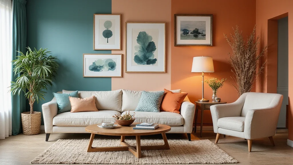
There’s something magical about the way color can transform a space. Every year, fresh color trends emerge, inspiring homeowners and designers alike. This year, I found myself craving a vibrant update to my home, so I decided to gather the latest trends in color palettes for home interiors that will leave you speechless! If you’re looking to refresh your space with stylish interiors, you’re in for a treat.
This post is crafted for anyone passionate about home design—from seasoned decorators to those simply wanting to bring a pop of color into their living rooms. You may feel overwhelmed by options, or maybe you’re just unsure where to start. Don’t worry; I’ve pulled together 18 stunning color trends that are not only visually striking but also create unique atmospheres in your home. Expect to find a variety of palettes that suit different tastes and styles, providing you with the inspiration you need to make your space truly yours.
Get ready to dive into a world of color that offers warmth, serenity, and boldness! Whether you prefer the calming hues of sage green or the energizing bursts of lime green, this guide will help you navigate the latest trends and choose the perfect shades for your home. Let’s explore these trends together and unlock the potential of your interiors!
Key Takeaways
– Discover 18 unique color palettes that can transform your home interiors, helping you find the perfect fit for your style.
– Explore popular trends like serene sage green and bold indigo blue, which are currently making waves in home design.
– Learn how color impacts mood and atmosphere, making your space feel either cozy or energizing depending on your choices.
– Get practical tips on how to incorporate these colors into your existing decor without overwhelming your space.
– Uncover actionable advice on mixing and matching colors for stylish interiors that reflect your personality.
1. Serene Sage Green
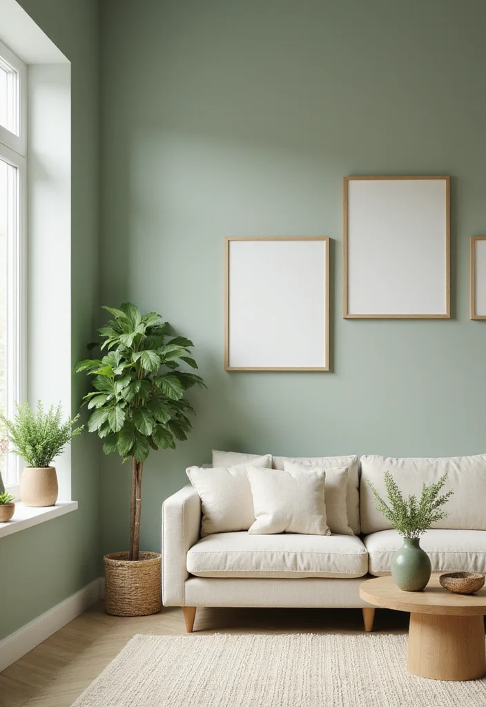
Sage green stands out as a top pick in interior design this year. This gentle, muted color radiates tranquility and connects us to nature, making it an ideal choice for relaxation spaces. Picture a cozy living room wrapped in soft sage paint, complemented by cream and beige furnishings to create a soothing atmosphere that invites calm.
To make the most of this beautiful color, consider using it in various ways. You can achieve a serene look without breaking the bank by opting for budget-friendly paint options or incorporating natural elements like wood. This color trend not only aligns with popular design styles but also fosters emotional well-being in your home.
Tips to incorporate sage green:
– Pair sage-painted cabinets with light oak shelving.
– Use butcher block countertops for warmth and texture.
– Add green plants to enhance the natural vibe.
This color creates an inviting atmosphere while showcasing the beauty of your decor, allowing textures and materials to shine together.
2. Vibrant Terracotta
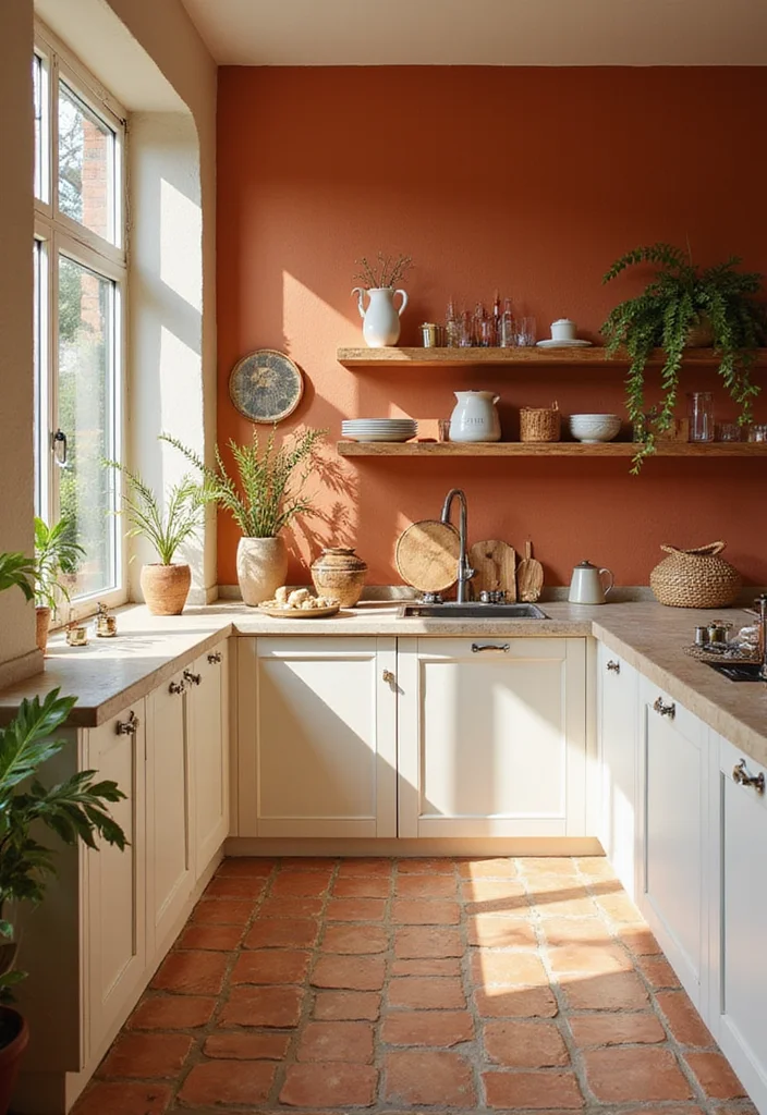
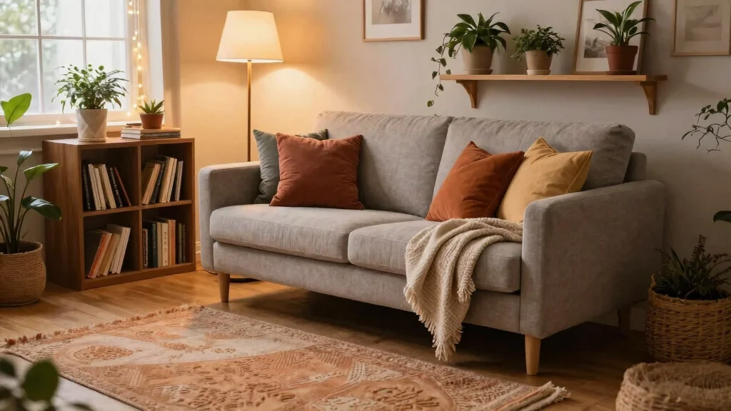
Terracotta is capturing hearts with its earthy charm and vibrant warmth. This lively hue adds an inviting atmosphere to kitchens and living spaces, whether through painted walls, terracotta tiles, or stylish decor accents. Imagine a cozy kitchen filled with terracotta tones, radiating a love for nature.
By thoughtfully incorporating terracotta, you can achieve a balanced and cheerful environment. Look for budget-friendly terracotta pieces at local markets or thrift stores to enhance your decor. This color complements current design trends, offering both comfort and a sense of connection to the earth.
How to use terracotta:
– Combine terracotta with light creams for a harmonious effect.
– Add terracotta pots filled with greenery for texture.
– Use textiles like throws to soften the overall aesthetic.
With strategic placement, terracotta’s warmth can elevate your home, making it feel cozy and inviting.
3. Bold Indigo Blue
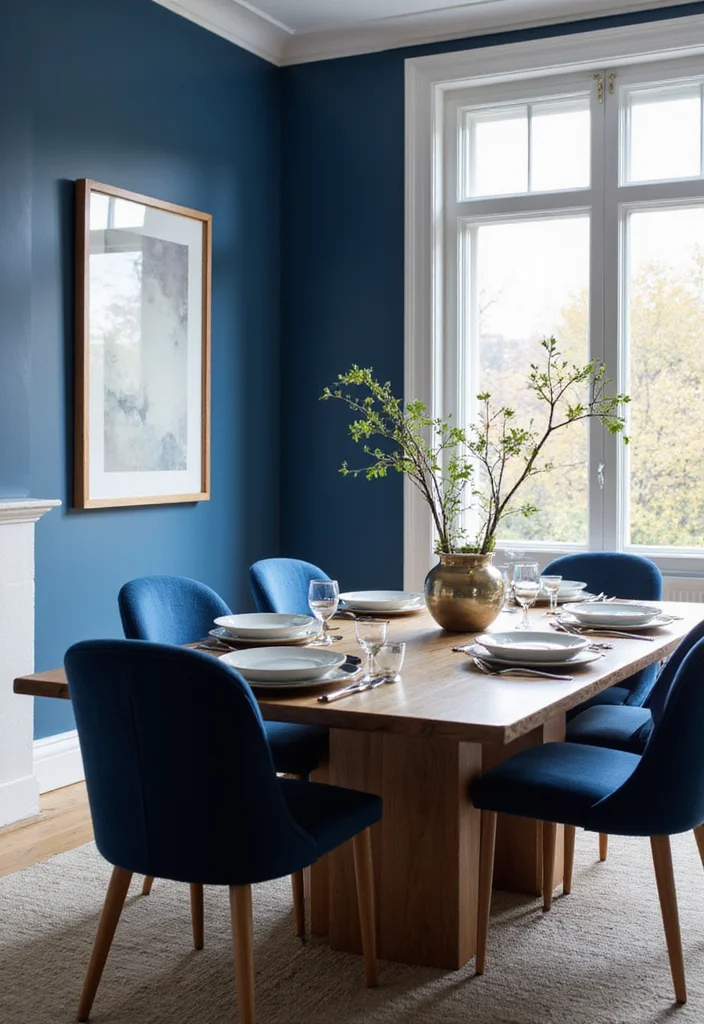
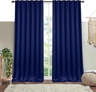
Indigo blue is the color of choice for anyone looking to make a bold statement this year. This rich hue conveys depth and sophistication, making it perfect for accent walls or standout furniture pieces. When you pair indigo with bright whites or light greys, the contrast is striking and eye-catching.
To incorporate indigo into your home, think about where you want to create drama and elegance. Budget-friendly options include indigo-dyed textiles or accessories that can easily transform a room without a full makeover. This color trend fits a variety of design styles, offering an adventurous twist for your space.
Ways to showcase indigo blue:
– Use indigo in dining rooms for a dramatic touch.
– Add indigo-dyed curtains to elevate the decor.
– Combine indigo with metallic accents for a luxe feel.
By embracing indigo, you can create a stunning atmosphere that reflects your personal style while remaining versatile and chic.
Bold Indigo Blue
Editor’s Choice




4. Cozy Mustard Yellow
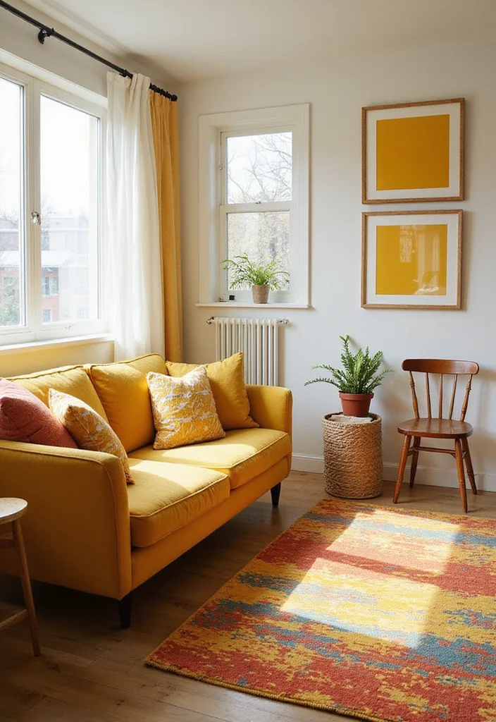
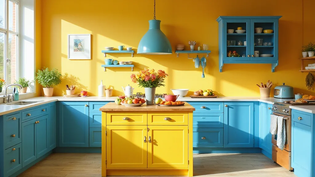
Mustard yellow brings a joyful burst of energy and warmth into your home. This cheerful shade works as a delightful accent color, promoting positivity and creativity in spaces like living rooms and kitchens. Imagine adding mustard yellow throw pillows or art pieces that instantly brighten your decor.
To effectively incorporate mustard yellow, consider pairing it with complementary colors that enhance its vibrancy. Look for affordable mustard accents at local stores or craft your own decor pieces. This color can enliven your home, making it feel welcoming and spirited.
Ways to incorporate mustard yellow:
– Pair mustard with navy blue for a striking contrast.
– Use mustard in kitchen accessories for a playful touch.
– Include it in artwork to infuse color and energy.
Mustard yellow creates an inviting atmosphere, ensuring your home feels lively and cheerful.
📹 Related Video: How To Combine Colors In Your Home & Look Cohesive (6 Tricks Designers Use)
5. Elegant Cream and Beige
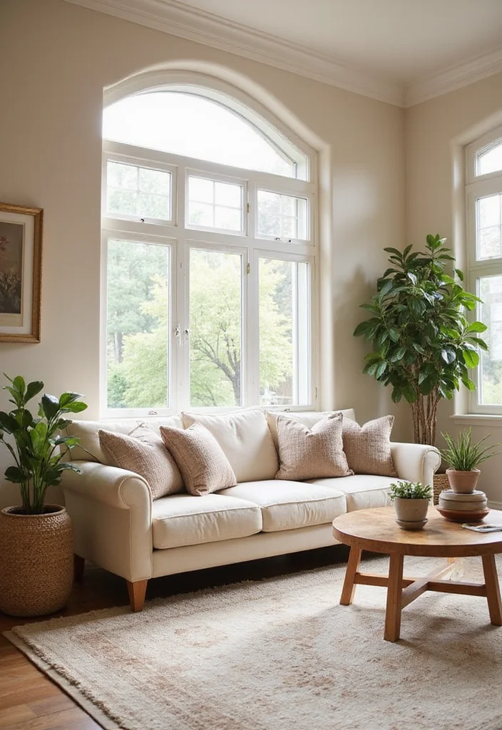
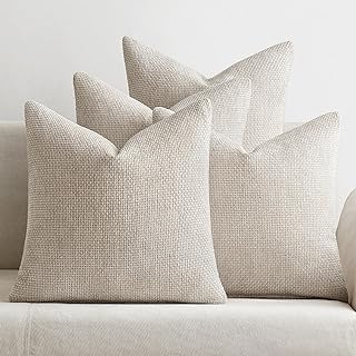
Cream and beige offer a timeless color palette that exudes elegance and tranquility. These versatile neutral tones create a serene backdrop, perfect for those who prefer understated beauty in their decor. Imagine layering these shades with rich textures and inviting patterns for a sophisticated look.
To maximize the potential of cream and beige, focus on mixing different shades and materials. Affordable options like thrifted decor or DIY projects can help achieve a layered effect without overspending. This color choice allows for endless creativity and comfort, enhancing your living space.
Tips for using cream and beige:
– Mix various shades and textures to create visual interest.
– Add vibrant accessories to brighten the neutral backdrop.
– Pair with natural materials like wood for warmth.
Embracing cream and beige creates a refined atmosphere, inviting relaxation and harmony into your home.
Elegant Cream and Beige
Editor’s Choice




Key Trade-offs & Our Top Pick
Option Comparison
1. Serene Sage Green
– Pros:
– Creates a calming atmosphere, perfect for relaxation.
– Pairs beautifully with natural materials like wood and stone.
– Cons:
– Can sometimes appear dull if not paired with brighter accents.
– Not ideal for small spaces as it might make them feel even smaller.
– Best for: Living rooms or bedrooms where tranquility is desired.
2. Vibrant Terracotta
– Pros:
– Adds warmth and a rustic charm to interiors.
– Works well with bohemian or Mediterranean styles.
– Cons:
– May clash with cooler color palettes.
– Can overwhelm smaller spaces if overused.
– Best for: Dining areas or kitchens where you want to invite warmth.
3. Playful Pastels
– Pros:
– Brings a light and airy feeling to any room.
– Versatile enough to fit in modern or traditional designs.
– Cons:
– Might feel too juvenile in adult spaces.
– Can fade quickly in direct sunlight if not properly treated.
– Best for: Children’s rooms or creative spaces that need a fun touch.
4. Luxurious Jewel Tones
– Pros:
– Adds richness and depth, instantly elevating the look of a room.
– Pairs well with metallic accents for a glamorous feel.
– Cons:
– Can make a space feel smaller if used excessively.
– Requires more attention to lighting to avoid heaviness.
– Best for: Formal living rooms or entertainment areas that aim for sophistication.
5. Minimalist Monochrome
– Pros:
– Simple and sleek, perfect for modern aesthetics.
– Easy to maintain and style with minimal accessories.
– Cons:
– Can feel cold or sterile without warm accents.
– Might lack personality if not accessorized properly.
– Best for: Small apartments or studios where space needs to feel open.
Expert Recommendation:
Best Overall: Serene Sage Green
Serene Sage Green stands out as the top choice for most people. It provides a soothing backdrop that promotes relaxation and pairs beautifully with various materials, making it versatile across different home designs. The calming effects are perfect for bedrooms or living areas while still being trendy, ensuring long-term durability without easily going out of style.
Why We Picked This:
While Serene Sage Green is a fantastic overall choice, those seeking a bolder statement might prefer Jewel Tones like emerald or deep sapphire. On the other hand, if you’re after something playful and youthful, pastels could be more your style. Each option has unique attributes, so consider what resonates most with your personal taste and home design needs.
6. Playful Pastels
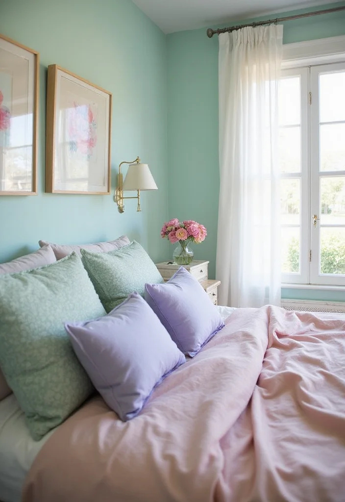
Pastels are making a vibrant comeback, allowing you to express your playful side in your home. Soft pinks, blues, and greens combine to create a dreamy atmosphere, perfect for nurseries, bedrooms, or any space needing a touch of whimsy. The lightness of pastels can uplift your mood and create a soothing retreat.
To incorporate pastels effectively, think about where you want to add a soft touch. Budget-friendly options include pastel throws, pillows, or artwork that can easily transform your space. This color trend can adapt to various styles, making it a delightful choice for any homeowner.
Ways to use pastels:
– Create a pastel gallery wall with soft-hued art.
– Use pastel pillows on neutral sofas for contrast.
– Incorporate pastel furniture for a retro vibe.
Pastels offer flexibility in styling, ensuring your home feels fun and inviting.
Playful Pastels
Editor’s Choice




7. Luxurious Jewel Tones
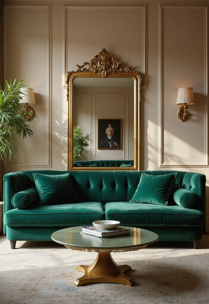
Jewel tones like emerald green, ruby red, and sapphire blue introduce a sense of luxury and opulence to your interiors. These bold colors make striking statements, especially in formal spaces such as dining rooms or living areas. Pairing jewel tones with gold or brass accents creates an elegant ambiance that feels sophisticated and inviting.
To integrate jewel tones into your decor, focus on standout pieces that command attention. Look for budget-friendly accessories or textiles that can enhance your existing decor without requiring a full overhaul. This color trend allows you to express personality and elegance in your home.
How to integrate jewel tones:
– Choose a statement piece, like a velvet sofa, in a deep jewel tone.
– Use jewel-toned accessories to accentuate neutral spaces.
– Layer jewel tones with rich textures for added impact.
Embracing these colors creates a glamorous atmosphere, ensuring your home feels both regal and welcoming.
8. Rustic Earth Tones
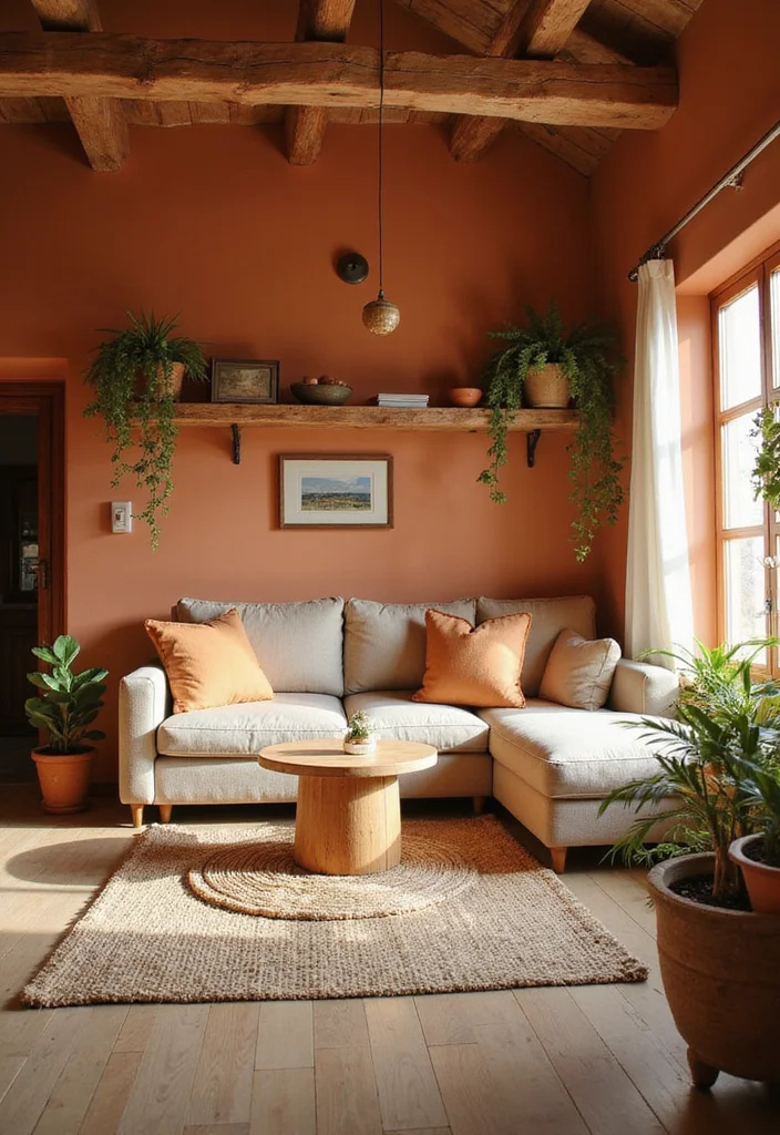
Earth tones like terracotta, deep browns, and muted greens bring a grounded and organic feel to your interiors. These colors celebrate nature’s beauty, making them ideal for creating a cozy, rustic vibe in your home. Earth tones blend seamlessly with wooden elements and natural fabrics, inviting warmth into your living spaces.
To embrace earth tones, think about how to incorporate materials that enhance the color palette. Look for budget-friendly wooden furniture or natural textiles that can elevate your decor. This color trend creates a warm and inviting atmosphere that connects you to nature.
Ways to embrace earth tones:
– Use wooden furniture to enhance the warm color palette.
– Combine with natural textiles like linen for comfort.
– Introduce greenery to complement the earthy hues.
By incorporating these colors, you create a harmonious environment that feels stylish and comforting.
You might also like
9. Minimalist Monochrome
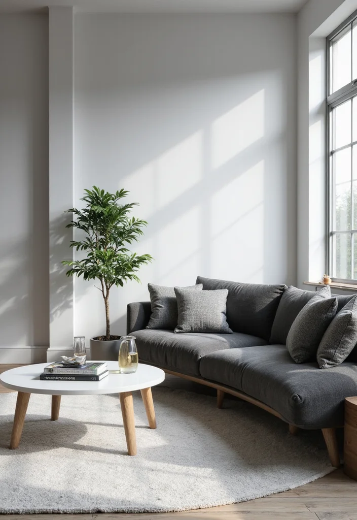
Monochrome palettes embody simplicity and sophistication, making them timeless choices for any home. Using shades of one color creates a sleek and modern aesthetic, helping small spaces feel larger and more refined. From crisp whites and greys to deep blacks, minimalist monochrome designs offer elegance and power.
To execute a monochrome look effectively, focus on varying shades and textures to add depth. Look for affordable decor items that can highlight your chosen color scheme without overwhelming your budget. This approach is perfect for creating clean, fresh, and stylish spaces.
Tips on executing a monochrome design:
– Use varying shades and textures to add depth.
– Highlight with contrasting accents like metallics.
– Keep decor streamlined and uncluttered for a cohesive look.
This style allows for endless creativity and a polished aesthetic in any home.
10. Warm Coral Accents
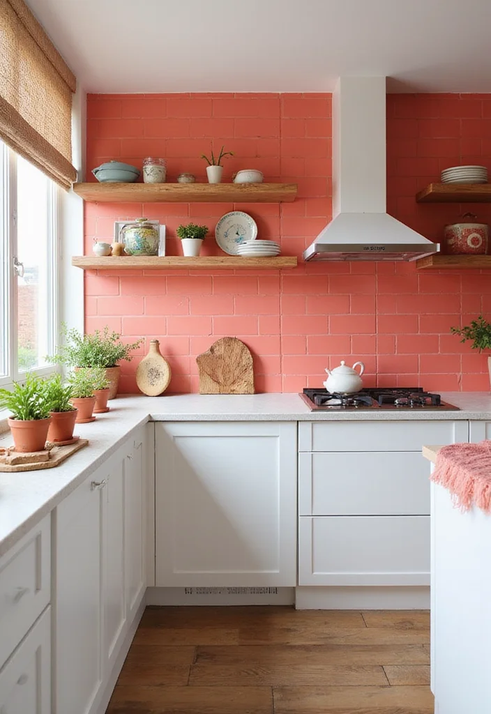
Coral is a vibrant and invigorating color that can brighten any space effortlessly. This warm hue serves beautifully as an accent color, infusing kitchens, bathrooms, and living areas with cheerful energy. Coral pairs wonderfully with both neutrals and bolder colors, making it a versatile addition to your decor toolkit.
To incorporate coral effectively, think about where you want to add a lively touch. Look for budget-friendly coral linens or decorative pieces that can enhance your existing decor. This color trend brings a sense of joy and liveliness into your home.
Incorporating coral:
– Use coral in linens or decorative pillows for a pop of color.
– Pair with teal or navy for a coastal-inspired look.
– Introduce coral furniture pieces to make a bold statement.
With its energy and warmth, coral can instantly uplift your surroundings, creating a vibrant home.
11. Soft Blush Tones
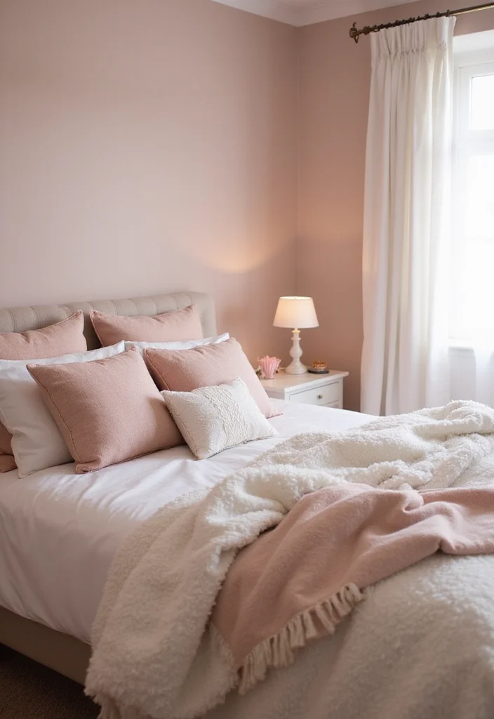
Blush is a gentle and romantic color that brings softness to your interiors. This subtle pink hue is perfect for creating a serene atmosphere, making it a popular choice for bedrooms and bathrooms. Blush harmonizes beautifully with whites, greys, and golds, enhancing the emotional connection to your space.
To use blush tones effectively, consider where you want to infuse a touch of elegance. Affordable options like blush bedding or curtains can create an inviting look without breaking the bank. This color trend adds a calming influence to your home.
How to use blush tones:
– Use blush in bedding or curtains for a soft touch.
– Pair with metallic accents for added sophistication.
– Incorporate blush furniture pieces for a trendy statement.
By embracing soft blush, your home can feel more inviting and peaceful, creating a lovely retreat.
12. Timeless Navy
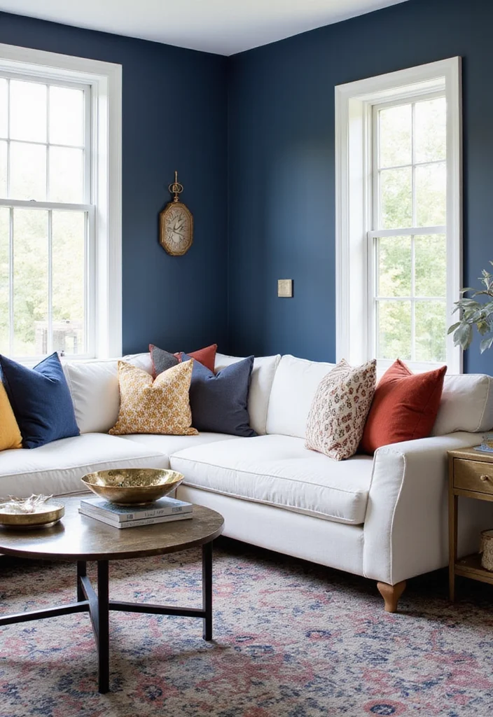
Navy blue is a classic and versatile color that can add depth and drama to your interiors. This rich hue excels at making bold statements, fitting beautifully in both modern and traditional settings. Whether used as an accent or dominant color, navy provides a sophisticated punch that enhances your space.
To incorporate navy effectively, consider where you want to create impact. Look for budget-friendly navy textiles or decor that can elevate your existing design. This timeless color complements various aesthetics, ensuring your home feels stylish and refined.
How to incorporate navy into your home:
– Use navy in wall colors for a stunning backdrop.
– Complement with bright white or metallic accents for contrast.
– Include navy in textiles for a touch of elegance.
Navy’s enduring nature allows it to blend seamlessly into any design aesthetic.
Timeless Navy
Editor’s Choice



13. Enchanting Lavender
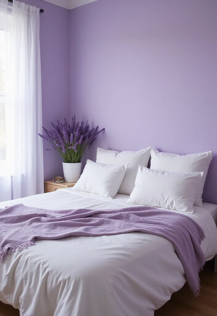
Lavender is a soft, calming color that promotes relaxation and peace. This gentle hue is perfect for bedrooms and serene spaces, creating a tranquil environment ideal for unwinding. Lavender pairs beautifully with creams, whites, and deeper purples, resulting in a harmonious and inviting look.
To incorporate lavender into your home, think about where you want to foster a calming atmosphere. Budget-friendly options like lavender accessories or throws can easily enhance your decor. This color trend brings a charming elegance to your living space.
Incorporating lavender:
– Use as a wall color to create a soothing atmosphere.
– Add lavender in accessories like candles or cushions.
– Use it in floral arrangements to add a natural touch.
Embracing lavender transforms your home into a peaceful haven, inviting relaxation at every turn.
14. Striking Black and White
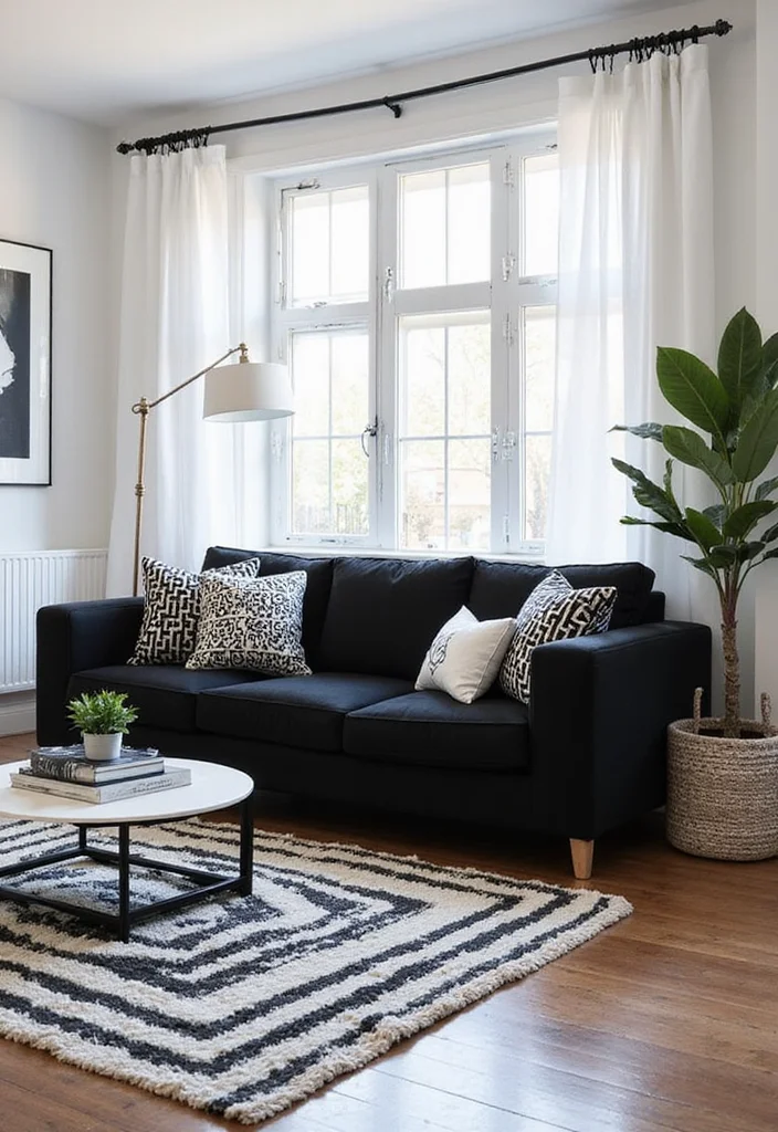
The classic black and white palette is making a stylish comeback, showcasing bold contrasts and timeless elegance. This color scheme creates striking visual impact, making a statement in any room. Whether styled in modern or vintage designs, black and white can craft dynamic and chic interiors.
To effectively utilize black and white, think about creating balance and interest through decor choices. Look for budget-friendly black and white patterns in textiles or decor that can elevate your space. This timeless color combination allows for endless creativity in home decor.
Ways to utilize black and white:
– Use black furniture against white walls for a bold look.
– Incorporate graphic patterns in rugs for added interest.
– Highlight with metallics for a touch of glamour.
Embracing this classic color combination opens up a world of design possibilities for your home.
You Might Also Like
15. Soft Gray Hues
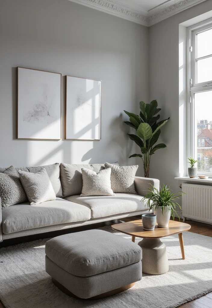
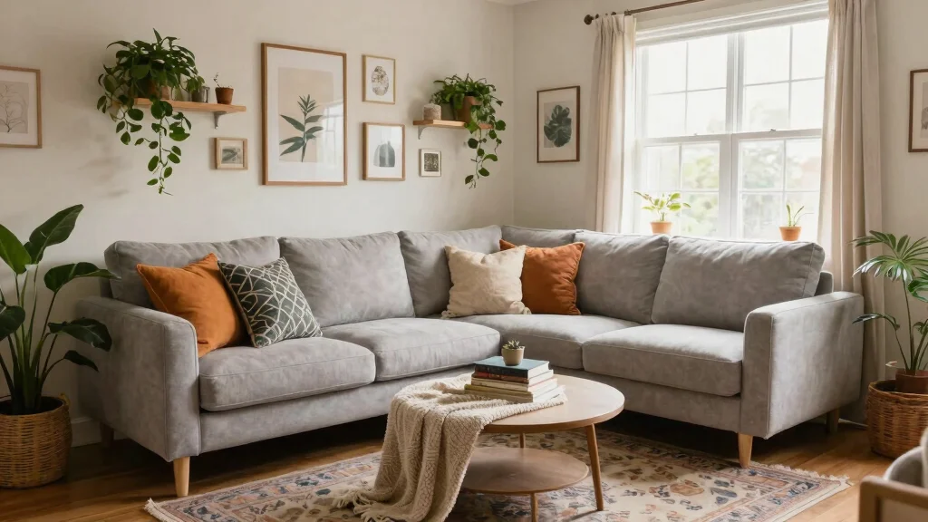
Soft gray is a versatile color that provides a sophisticated backdrop for any room. This neutral shade allows for endless decor possibilities, pairing beautifully with both warm and cool tones. The appeal of soft gray lies in its ability to create a calming and elegant atmosphere throughout your home.
To use soft gray effectively, think about how to create an airy feel in your spaces. Affordable options like soft gray paint or textiles can enhance your decor without overwhelming your budget. This color trend offers flexibility and sophistication.
How to use soft gray:
– Use as a base color for walls to maintain an airy feel.
– Pair with bright colors for contrast and vibrancy.
– Incorporate in textiles and furniture to add depth.
The beauty of soft gray is that it complements any style, ensuring your home feels inviting and stylish.
16. Energetic Lime Green
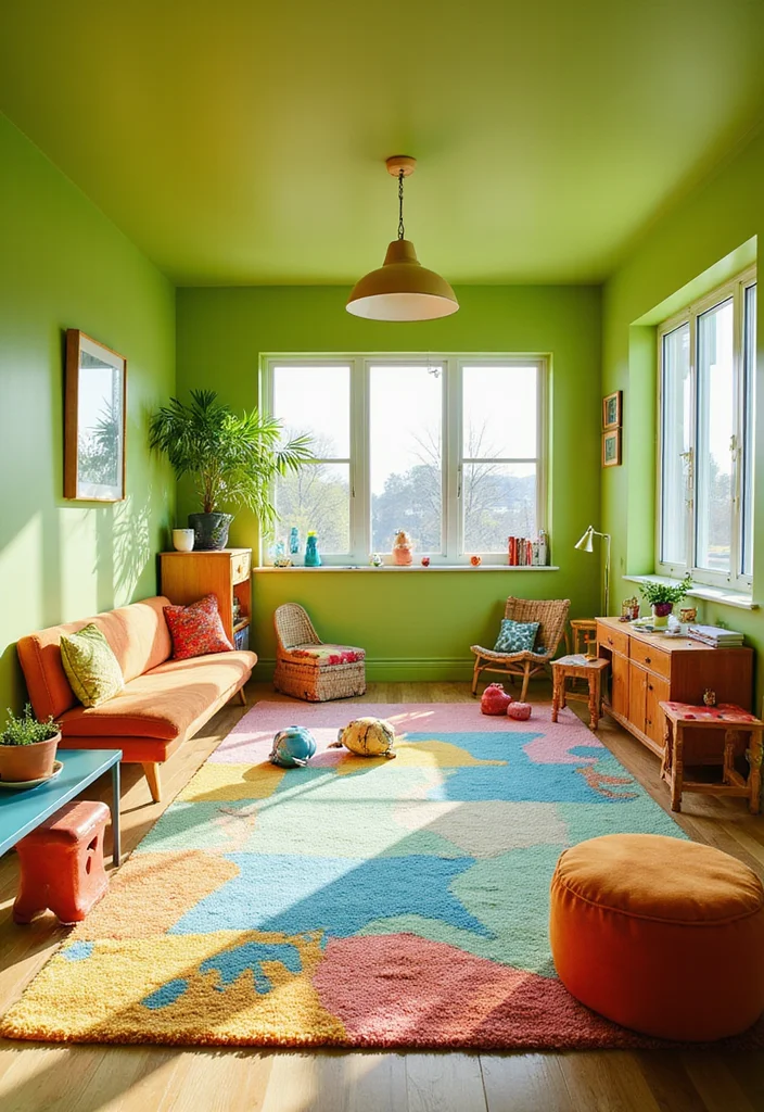
Lime green is the perfect color for those wanting to inject energy into their interiors. This vibrant hue inspires creativity and fun, making it an excellent choice for playful spaces like kids’ rooms or home offices. Whether used as a bold accent or a main color, lime green stands out refreshingly.
To incorporate lime green successfully, think about where to add a splash of vibrancy. Look for budget-friendly decor items that can enhance your existing design without a complete overhaul. This lively color trend invites a sense of playfulness into your home.
Incorporation tips:
– Use lime green in fun areas, such as kids’ rooms.
– Pair with neutrals to balance the vibrancy.
– Accessorize with lime green decor items for a subtle touch.
Lime green encourages a lively atmosphere, making any space feel fresh and exciting.
17. Sophisticated Charcoal
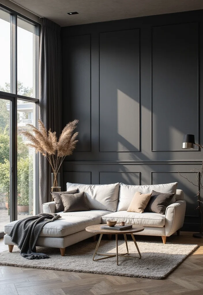
Charcoal is a deeply sophisticated color that brings modern elegance to interiors. This striking shade works beautifully as a primary or accent color, adding depth without overwhelming your space. Pairing charcoal with lighter tones creates stunning contrasts that feel current and stylish.
To incorporate charcoal into your decor, think about where to create a contemporary vibe. Look for budget-friendly charcoal textiles or decor items that can enhance your existing style. This versatile color fits seamlessly into various decor styles, from modern to eclectic.
How to incorporate charcoal:
– Use in living rooms for a contemporary feel.
– Pair with industrial elements for an urban vibe.
– Implement in textiles to add richness and warmth.
Charcoal’s modern charm allows you to create an inviting and sophisticated environment.
Sophisticated Charcoal
Editor’s Choice


18. Warm Almond Tones
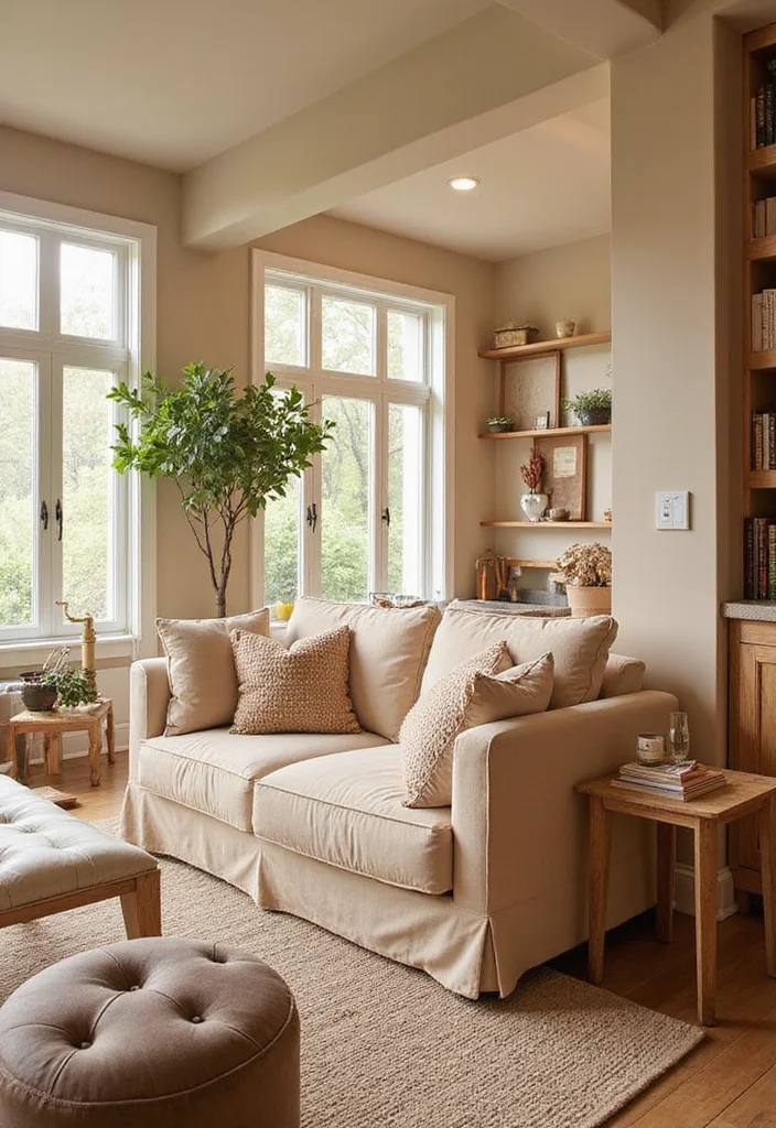
Almond tones create a cozy, homey feel that evokes warmth and comfort throughout any space. These neutral shades are perfect for crafting a welcoming atmosphere, making them ideal for living rooms and entryways. Almond tones mix beautifully with other colors, allowing for easy decor combinations that maintain a cohesive look.
To use almond tones effectively, consider how to create a warm palette in your home. Look for budget-friendly decor items that enhance the overall warmth without breaking the bank. This color trend fosters a nurturing environment that feels just like home.
How to use almond tones:
– Use as a base for a warm, inviting palette.
– Combine with soft blues or greens for a fresh feel.
– Accessorize with natural materials like wood for texture.
Embracing almond tones creates a comforting atmosphere, making your home feel inviting and nurturing.
Conclusion
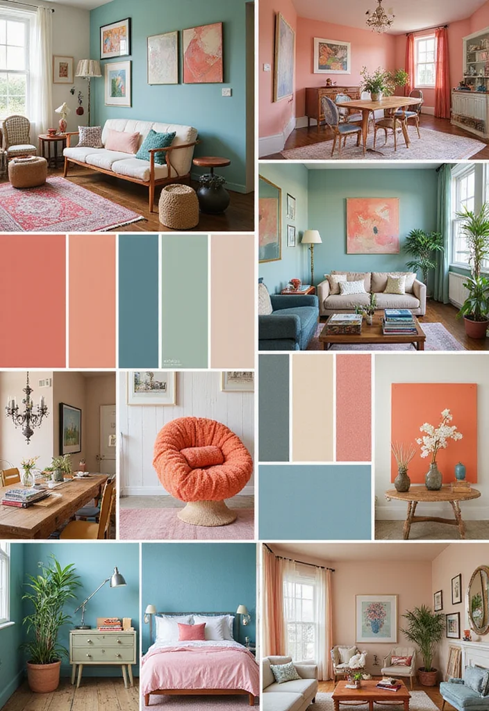
With these 18 color trends for home interiors, 2024 is set to be a vibrant year for home design!
Each color palette tells a unique story and offers endless inspiration for creating stylish interiors that reflect your personality. Whether you prefer bold hues or gentle pastels, there’s something for everyone. Embrace these trends and transform your space into a breathtaking retreat that leaves everyone speechless.
Note: We aim to provide accurate product links, but some may occasionally expire or become unavailable. If this happens, please search directly on Amazon for the product or a suitable alternative.
This post contains Amazon affiliate links, meaning we may earn a small commission if you purchase through our links, at no extra cost to you.
Frequently Asked Questions
Which color palettes from the 18 trends are the easiest to start with for home interiors?
The easiest way to begin is with a neutral base and one or two trend colors as accents. For color palettes for home interiors, think creams or greiges as a foundation, then add earthy greens, soft terracotta, or moody blues as statements in textiles, art, or a single accent wall. Test with large swatches on walls, fabrics, and furniture, and build a simple mood board to compare how the tones interact with natural light. By starting neutral and layering color, you can achieve stylish interiors without overwhelm.
If you’re unsure, start in one room first and let that palette guide your choices elsewhere in the home, keeping home design cohesive.
How can I incorporate bold color trends without overcrowding a space?
Bold color trends can energize a room without overwhelming it. Start with a calm neutral base on walls, then bring in one or two bold trend shades through accessories, textiles, and art. Use the 60-30-10 rule to keep balance (60% neutral, 30% secondary color, 10% accent). Test with cushions, rugs, and wall art before committing. For kitchens or bathrooms, a single colored cabinet or tile can act as a focal point while the rest remains neutral. This approach keeps color palettes for home interiors practical for home design and stylish interiors.
Remember, small, repeatable bursts of color often have the biggest impact.
Which color combinations pair best with natural materials like wood and stone?
Pair warm wood tones with earthy greens or soft terracotta for a cozy, nature-inspired vibe. Cool stone shades like slate, charcoal, or dove blue work beautifully with crisp whites and sandy neutrals. Don’t forget metallic accents (brass, brushed brass, warm gold) to add a touch of luxury. The goal is harmony: keep undertones aligned across surfaces and textiles so your home design feels cohesive and stylish interiors.
Try a palette that uses a warm base on walls, with an accent color pulled from your wooden furniture or stone countertops.
What’s the best way to update my space with these color trends on a budget?
You don’t need a full redo to embrace the trends. Start with paint on one or two walls to create a feature that echoes the trend colors. Update textiles—cushions, throws, curtains—and swap out accessories like vases and wall art to reflect the new palette. Removable wallpaper or decals can test bolder patterns without a long-term commitment. Repaint or refinish a single piece of furniture to nod to the trend rather than redoing everything. This approach keeps color palettes for home interiors fresh and stylish interiors within reach on any budget.
Small updates can have big impact when you focus on cohesive undertones.
How can I keep color palettes cohesive across rooms while applying these trends?
Start with a base neutral that runs through all spaces and choose a shared undertone (warm, cool, or muted) to tie rooms together. Pick a primary accent color from the 18 trends and repeat it in every room—through a pillow, artwork, or a rug—so there’s a unifying thread. Use variations of the same color family in each room to keep things stylish interiors while still feeling distinct. Document your palette in a simple mood board or notes so furniture finishes, fabrics, and wall colors harmonize as you expand from living to bedrooms and beyond.
By planning ahead, you’ll maintain cohesive color palettes for home interiors across the entire home.
Related Topics
home decor
color trends
interior design
stylish interiors
color palettes
modern aesthetics
vibrant hues
minimalist design
seasonal colors
home makeover
quick updates
beginner friendly